How to Style Sculptural Ceramic Vessels in Interiors
Sculptural ceramic vessels are not simply decorative objects. They shape the atmosphere of a space — quietly, but with presence.
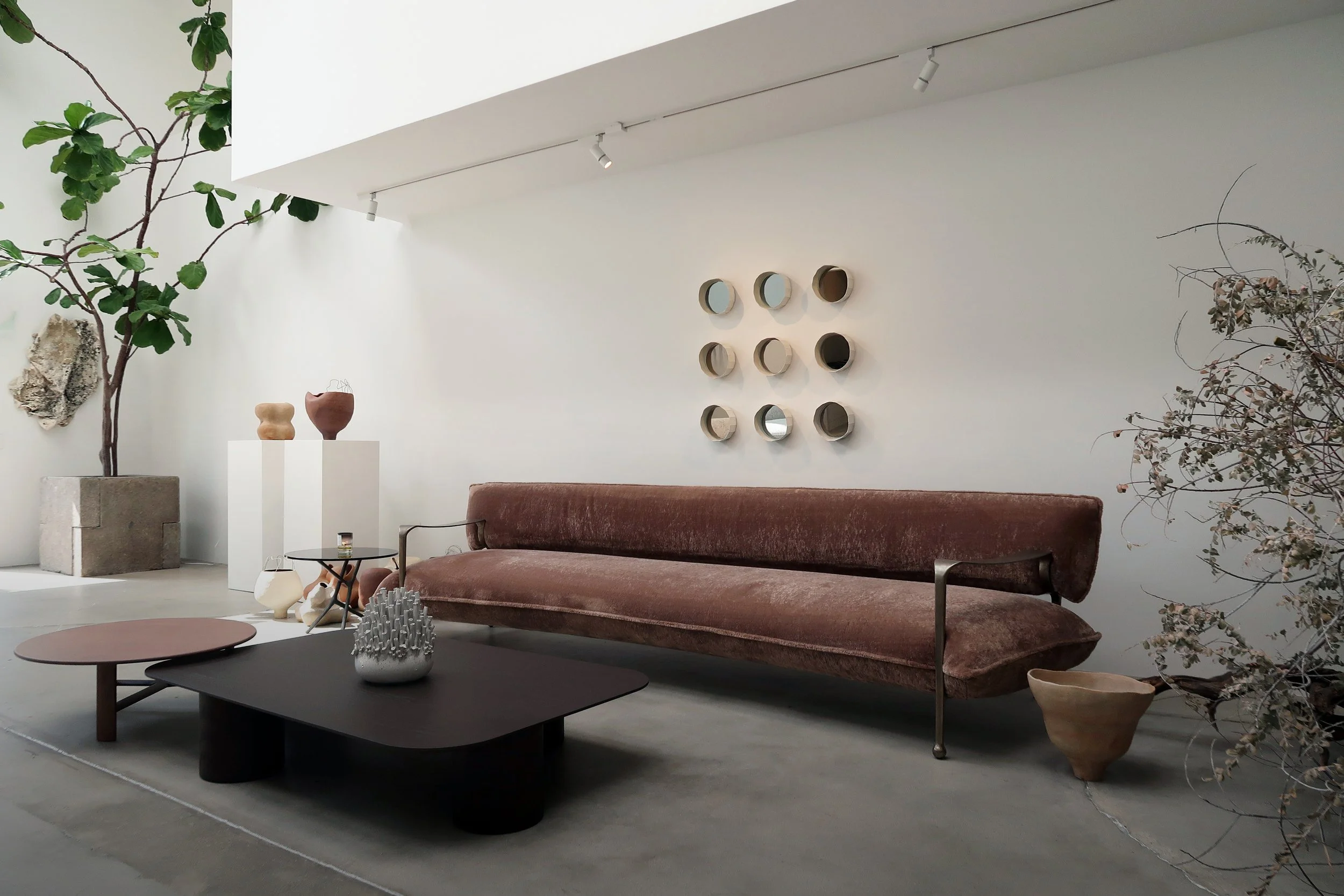
In interiors, I often see them placed where they can breathe: on a dining table, a console, or a low pedestal. Not crowded. Not competing. Allowed to exist on their own terms.
A single vessel can hold more weight than a group of smaller objects. It becomes a focal point, not through size, but through form.
In living rooms, these pieces often sit low — on a coffee table or near the ground — grounding the space. In dining areas, they introduce softness against structured furniture. In more minimal interiors, they bring necessary imperfection.
What matters is not symmetry, but balance.
Collectors and interior designers are often drawn to sculptural ceramics because they exist between function and art. A vessel may hold nothing — and still feel complete.
Each piece enters a space differently. Some integrate quietly. Others hold attention.
The role of the object is not to decorate, but to shift the feeling of the room.
On material and surface
Unglazed stoneware reads differently from ceramics glazed in a glossy finish. The raw surface catches light in a way that changes throughout the day — something matte and textured will look different at noon than it does at dusk. This is worth considering when placing a piece. Near a window, the form becomes more dimensional. In a darker corner, the texture softens and recedes.
Organic forms — irregular, asymmetrical, shaped by hand — tend to work well in spaces that are otherwise very structured. They introduce something that wasn't planned. That tension is often what makes a room feel alive rather than assembled.
On grouping versus solitude
There is no rule that says ceramics must be grouped. In fact, one of the most common mistakes is placing too many objects together out of a fear of emptiness. A single sculptural vessel on a wide shelf, with nothing beside it, can be more powerful than a carefully curated cluster.
If you do group pieces, consider varying the height significantly — and limit the number. Two or three at most. The eye needs somewhere to rest.
On color and finish
Neutral tones — warm whites, clay, terracotta, deep charcoal — tend to work across many interior styles because they don't compete with the room. But a darker or more distinctive piece can act as punctuation. It marks a moment in the space.
Unglazed surfaces age gracefully. Over time they absorb the environment around them — small marks, slight shifts in tone. For some collectors, this is the point. The object becomes more itself over time.
A note on placement
The best placement is usually the one that feels slightly unexpected. Not centered, not obvious. Slightly off. That small decision — moving a vessel two inches to the left, placing it on the floor instead of a shelf — can change how the entire room reads.
Trust that instinct. It's usually right.
To check out my work, please follow the links below: